Signs are all about grabbing attention, so why create a sign that’s not going to be effective? After all, that’s basically throwing your money away.
So, there’s one rule that you need to follow to make sure your signs stand out – Choose the right font.
Simple as that. Choose the right font and everything falls into place. But there’s a trick.
Fonts are organised into three basic categories – serif, sans-serif and script. Script fonts are beautiful to look at and work very well for short titles or names. But if you’re going to use a script font there’s ONE rule – don’t write in all capitals.
Below is an example.
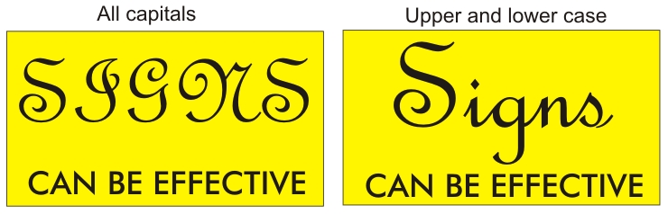
You can see here the immediate difference in readability. And yes, these two are the same font. A short headline title needs to be legible, and using upper and lower case is the only way to go when using script fonts. There are some other tips to follow as well.
Fonts not to use
Whatever you do, don’t use Algerian or Comic Sans. They’ve been overworked and overused and just don’t have any impact anymore, despite being universally available. Times New Roman is another font to avoid.
The current trend is to use thin sans-serif fonts such as Roboto or Gotham. These are available in different weights and look great either as a headline title or as a paragraph of text.
If you’d like to tips on how to make your signs stand out, then speak to the experts at Perth Graphics Centre who can guide you through the design process.